|
|
|
|
|
A report published by MIT suggests the world faces a uranium shortage from 2013. So, a few excel spreadsheets later, we have a rough-and-ready Vulnerability Index for you. Most vulnerable, by our reckoning, are France, Japan and South Korea. Most secure are Australia, Kazakhstan and Uzbekistan. More here.
We are seeing something of a gold rush by Asian central banks, as they buy from the market or the IMF. The following charts give an overview of gold reserves (in tonnes). First, the pie chart shows major gold reserves, with the top six holdings comprising two-thirds of all reserves - with even China and Japan holding just two per cent (each) of all reserves. (The UK is languishing on one per cent.)
The second chart shows countries with more than 1000 tonnes of gold as of end Q1 2009. French and Swiss reserves are falling and Chinas are increasing, but the other countries holdings are static. Note that overall reserves are falling:
And we were interested to see whose holdings were increasing the fastest: those with small gold reserves, or those with large? Big holders have increased their proportion at the expense of the small to medium (200-500 tonnes). Very small holdings have remained constant to Q1 2009, but recent transactions are likely to change this:
More analysis - comparing to GDP - forthcoming. All data courtesy of the World Gold Council. Last updated November 20, 2009.

Is there enough uranium to satisfy the increasing demand for nuclear energy? The table below shows states reserves (in tonnes of uranium and as a proportion of world reserves) against states nuclear consumption (in TWH and as a proportion of world consumption).
The ratio of the two proportions have been used to create a vulnerability index in which Australia has greatest uranium security (high reserves and no consumption), while France has the least (high consumption and no reserves). Last updated November 18, 2009.
Platitudes, perhaps, but positive: two, sides, co-operation, dialogue, agreed, development and security are all frequent in the joint statement. Good luck finding rate, though: neither exchange rate nor interest rate feature prominently, in spite of their importance to each state.
Angola, Mongolia and Papua New Guinea are in getting in on the act this year and setting up their own sovereign wealth funds. They bring to ten the number of new SWFs set up in or around 2009. Its a bumper year:
N.B. The value of each new SWF is not necessarily larger. Its hard to tell as the data gives the current values of older SWFs, which are likely to have grown with time.
Sources: SWF Institute and Oxford SWF Project
Two conclusions are typically drawn from the large excess reserves held by banks: (1) liquidity policies arent flowing through to the man in the street; (2) large excess reserves make inflation likelier.
A preliminary paper from staff at the New York Fed disputes both conclusions, saying the quantity of bank reserves is no indicator of the effects of Fed policy on bank lending, and that a large increase in reserves need not be inflationary.


The following charts show how the 10.2% headline unemployment figure breaks down by sector and by demographic. Pity young construction workers! Perhaps they could be retrained to work in education, where employment month-on-month has actually risen.

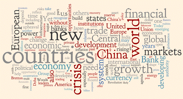
Most frequently occurring verb: continue. The word recovery is very small; debt, housing and markets are far more prominent. And favourite adjectives, bizarrely starting with s: sluggish, stable, subdued, slow, slack, and gradual. Courtesy of wordle.net. Last updated November 5, 2009.

The UK government has announced new bail-out terms for RBS and Lloyds bank, effectively doubling its investment a year ago. At the same time, European competition commissioner Neelie Kroes has announced required divestments for the banks, as well as an unexpected requirement that the RBS group not be a top four player in the debt markets.
The UK government has hailed changes to the bail-out as a reduction in risk, but is this misleading? Lloyds exit from the asset-backed security programme just means the explicit guarantee becomes implicit, and is given away for free: until living wills and the special resolution regime are up and running, the markets will treat both banks as insured.
Ms Kroes tenacity is widely applauded: she is the heroine of Andrew Hills amusing casualty list.

A new report compares nations responses to the issue of unemployment. Within the OECD report is a handy comparative table, with the following headline findings:
Last updated October 29, 2009.

Below are total correlations (left) and individual country correlations (right, click for legible image):
 The summed correlations (left) give an indication of how in step any one country has been with the international response. Note that Portugal and the UK are the only two countries to sum to a negative correlation (so their response is highly out of step).
The correlation data is experimental and should be taken as such: for a start, it is dependent on the categories the OECD has created, presumably a tricky and subjective exercise. And correlations are designed for near-continuous sets of data where the numbers move a little at a time, whereas here the formula has been shoe-horned in to binary data (was this policy used: yes/no). Still, the data is at least indicative and I hope you find it interesting.
The Economist highlights data from a new NBER paper, which tries to track poverty trends between 1970 and 2006. The research finds poverty at far lower levels than most contemporary research. The analysis by continent is clear: a dramatic reduction in East Asian poverty, while poverty has fallen only slightly in Africa. Last updated October 27, 2009.
 US debt has declined for the first time since 1954 (see image to the right). A large reduction in private sector borrowing has more than offset the increase in government borrowing.
New research analyses the historical trends in government, corporate and household debt, and finds similar trends across the US, Japan and the UK. Last updated October 5, 2009.
Further to the charts Chris has highlighted, some gems from the WEO report. Last updated October 1, 2009.


See Obamas speech in a whole new light: in the graphic below, the largest words were the commonest in President Obamas speech Financial Rescue and Reform. Courtesy of wordle.net. Last updated September 14, 2009